UX & Product design for
startups and enterprise.
Bringing clarity to complex systems.
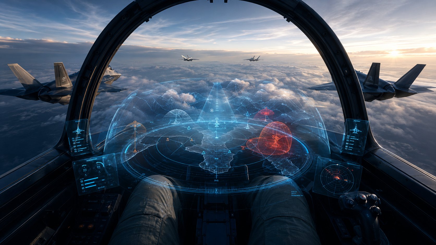
My niche:Enterprise0 – 1DefenseHealthcareGamesAISpatial ComputingWorldbuilding


My work
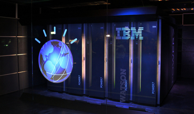
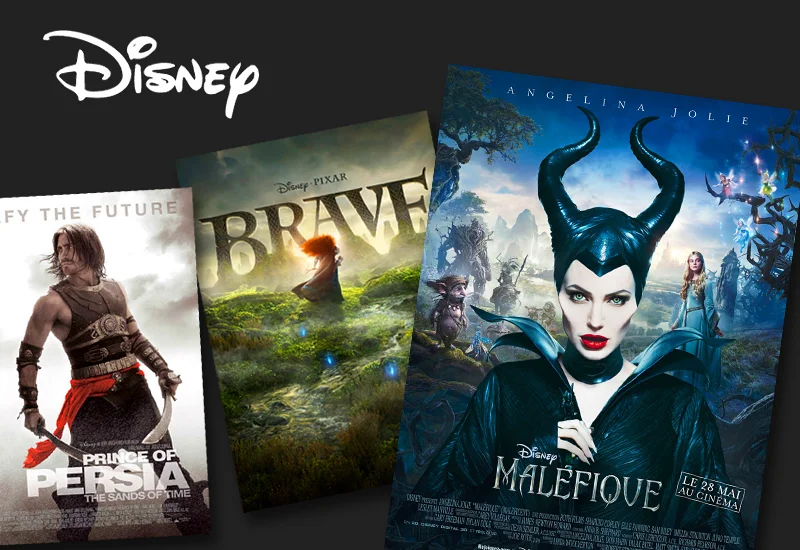
FORMicrosoftAdobeNVIDIAGoogleDisneyMeta Co.StarbucksAT&TActivisionBioWareESPNNorthrop GrummanLockheed Martin

UX, EXPERIENCE DESIGN, VIDEO PRODUCTION[VIEW]

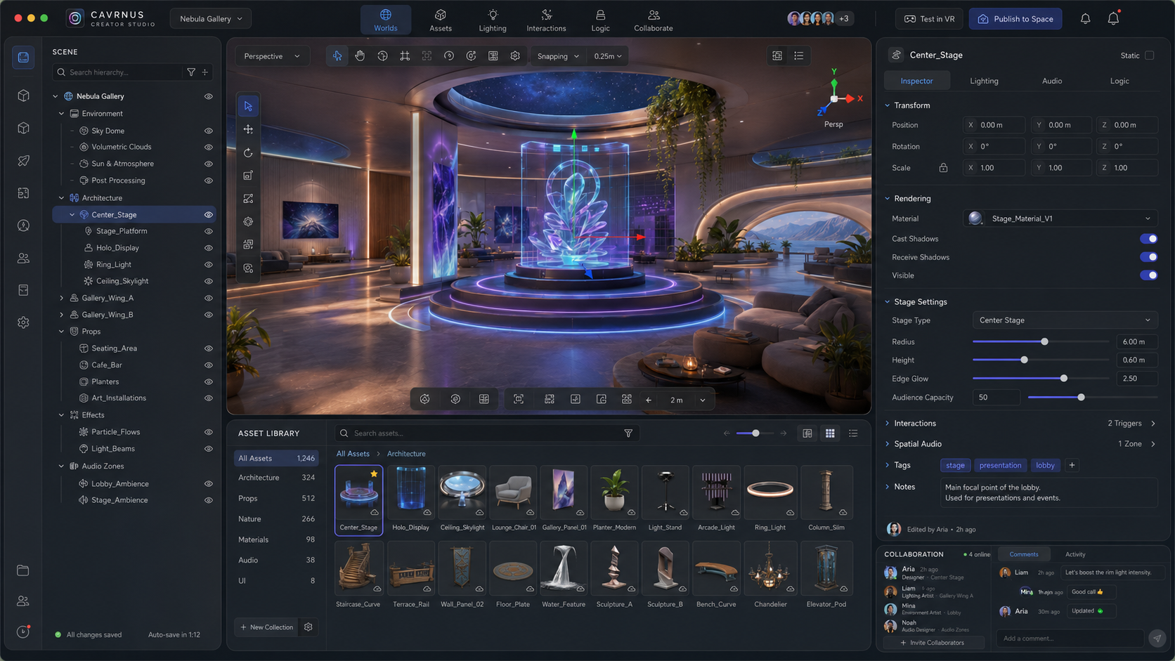
UX, EXPERIENCE DESIGN[VIEW]

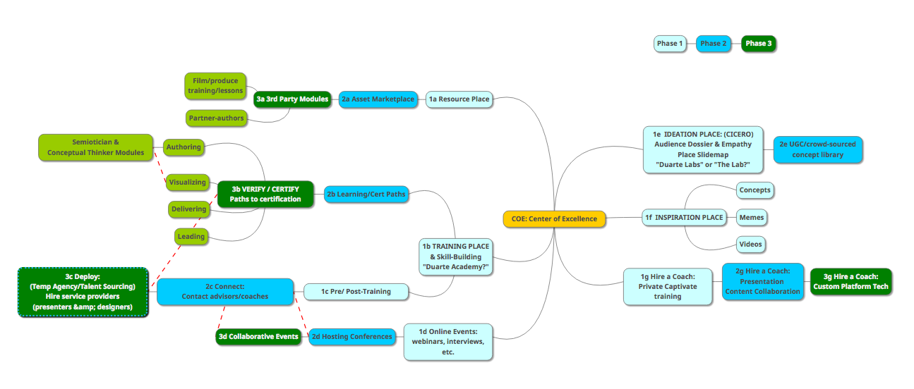
DIRECTOR OF PRODUCT DESIGN[VIEW]
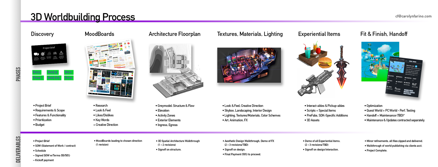
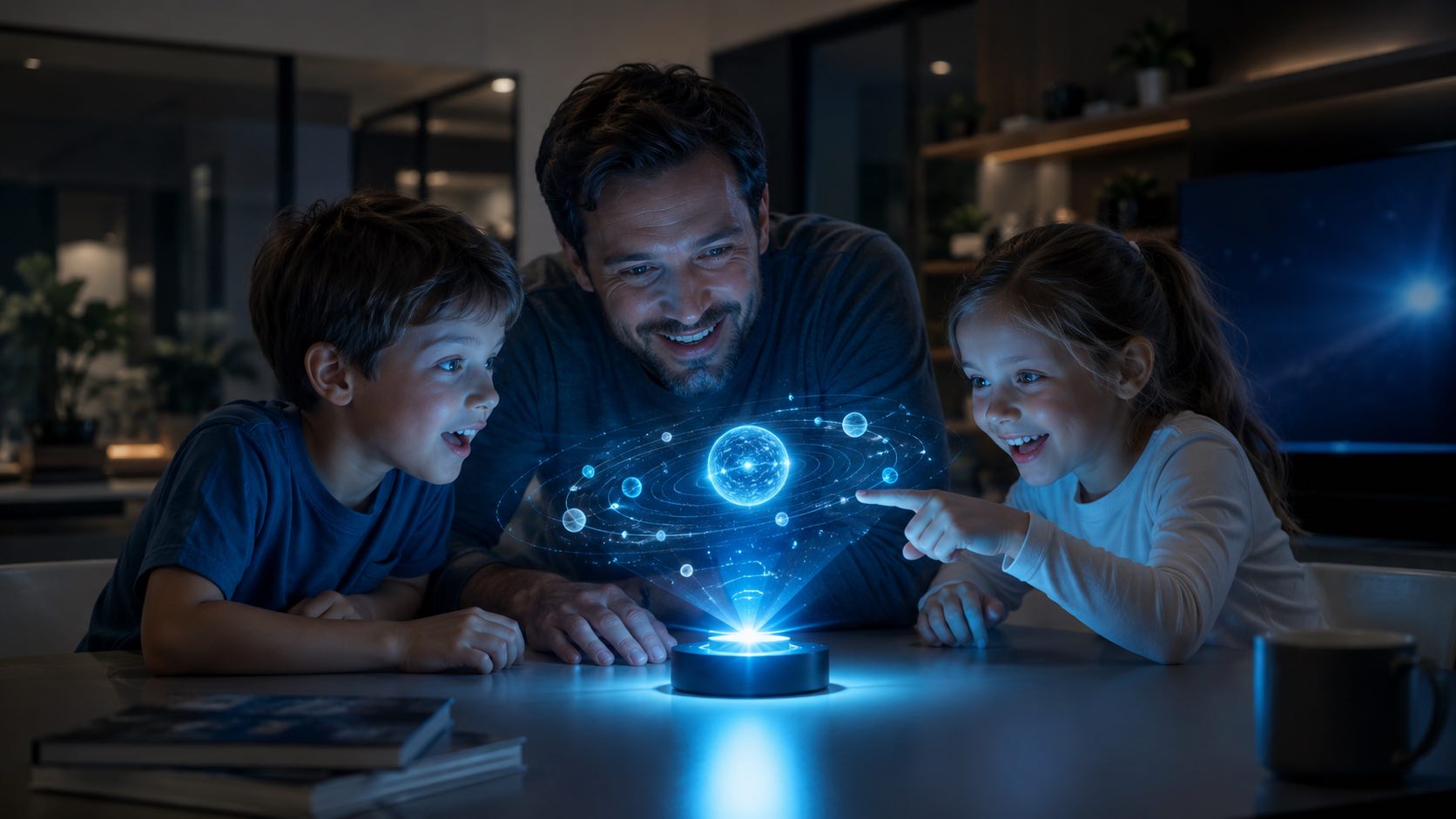
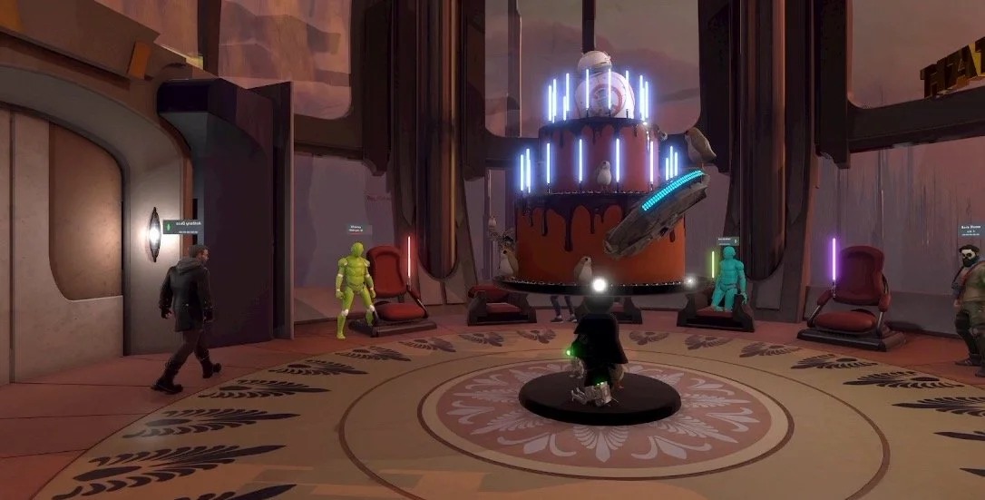
WORLD DESIGN, 3D ART[VIEW]
EXPERIENCE DESIGN[VIEW]

WORKSHOP FACILITATION[VIEW]
DIRECTOR OF PRODUCT DESIGN[VIEW]

CONCEPT, UX DESIGN[VIEW]
PRODUCT DESIGN[VIEW]
PRODUCT DESIGN, BRAND[VIEW]
PRODUCT DESIGN, MARKETING[VIEW]
PRODUCT VISION, UX, CONCEPT DESIGN[VIEW]